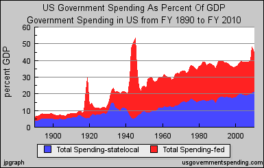
 Source.
Subscribe to:
Post Comments (Atom)
Blog topics include politics, economics, housing, and the stock market.
 Source.
James Parsons
Washington, D.C. area, USA
I'm a classical liberal, because I believe a system of personal freedom and free enterprise leads to greater human well-being than other legal and economic systems.
I am the webmaster for JP's Real Estate Charts, Stoxford Stock Charts, and The Libertarian Quiz.

This graph is a refreshing perspective. There is so much anti-federal government rhetoric but looks like people are for the most part looking in the wrong place. State & Local seem to be where government has grown. It would be interesting to see a further breakdown between "state" & "local"
ReplyDelete